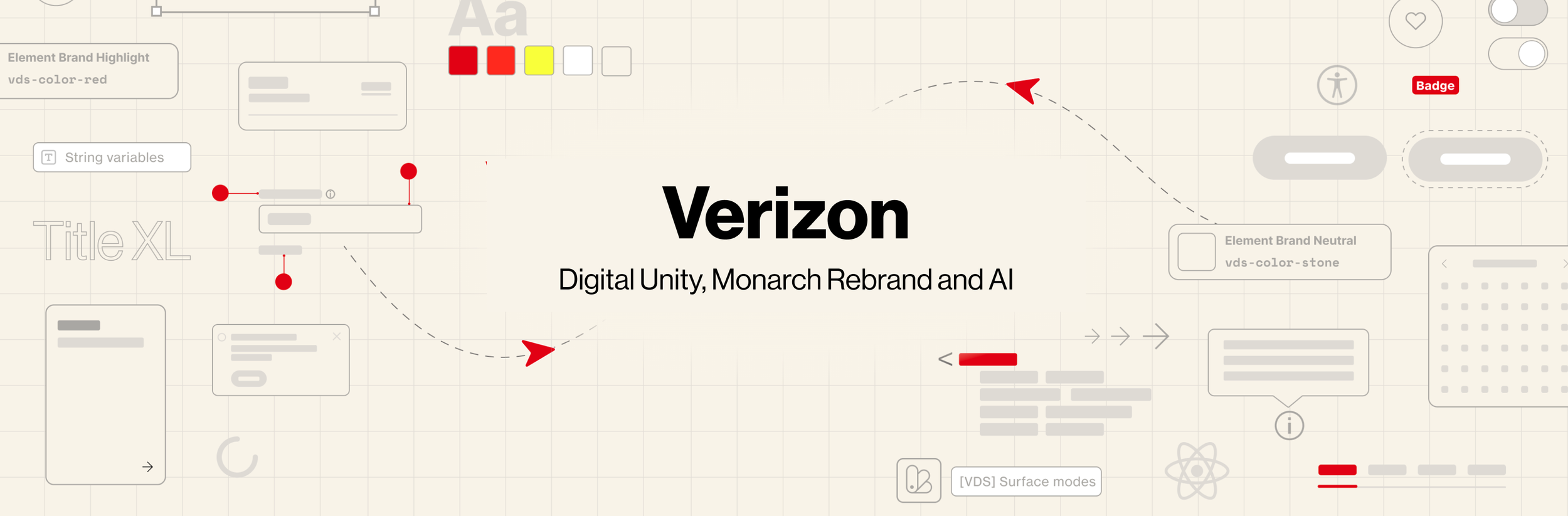
Overview
At Verizon, I worked as a Senior Product Designer during a pivotal moment of transformation, the launch of the Monarch rebrand and the unification of design standards across one of the largest digital ecosystems in the world.
My role sat at the intersection of brand, product systems, and platform governance, where clarity, scalability, and consistency were essential.
I was on the Digital Unity team, responsible for creating, documenting, and scaling new design patterns across Verizon’s product organization. In parallel, I partnered closely with journey teams to ensure their work aligned with evolving brand and UX standards.
These case studies outline the problems we faced, the process followed and the solutions I help to define.

Monarch rebrand
Problem - Redefining an icon
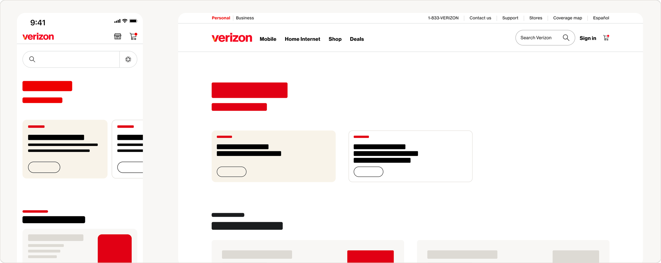
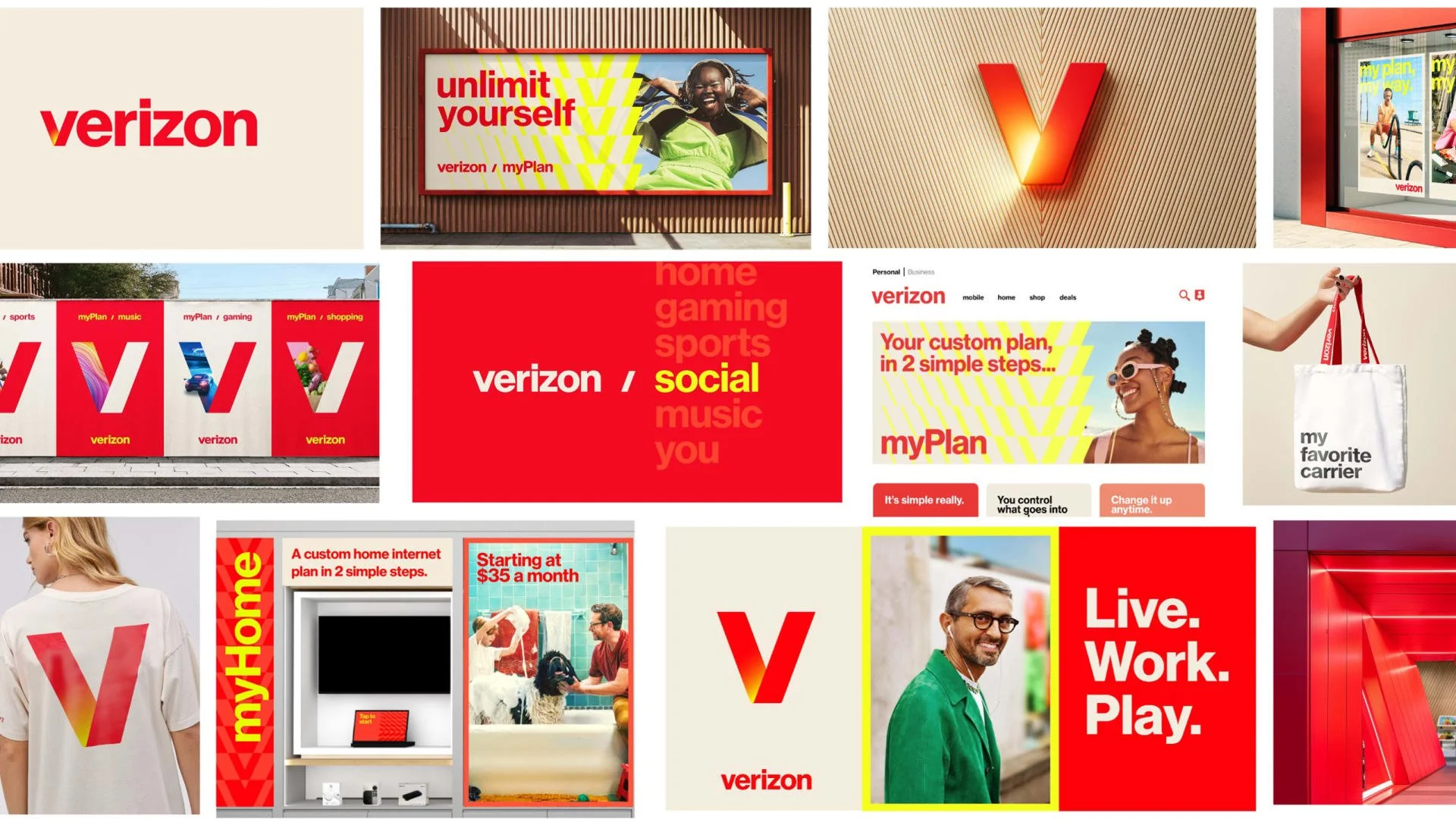
Verizon’s Monarch rebrand introduced a bold new visual language. Vibrant color, expressive typography, and marketing forward imagery. While the brand work was strong, applying it consistently across complex product experiences introduced risk.
Without guardrails, the ecosystem risked fragmentation, visually, experientially, and strategically.
Process
Designing the rules of the system
I contributed to the iteration strategy by defining guiding principles and facilitating alignment workshops with partners.
Our work centered on:
* Defining when and where brand expression should show up
* Creating concepts and guidelines that scaled
* Reviewing and critiquing work from journey teams to ensure consistency
Changes
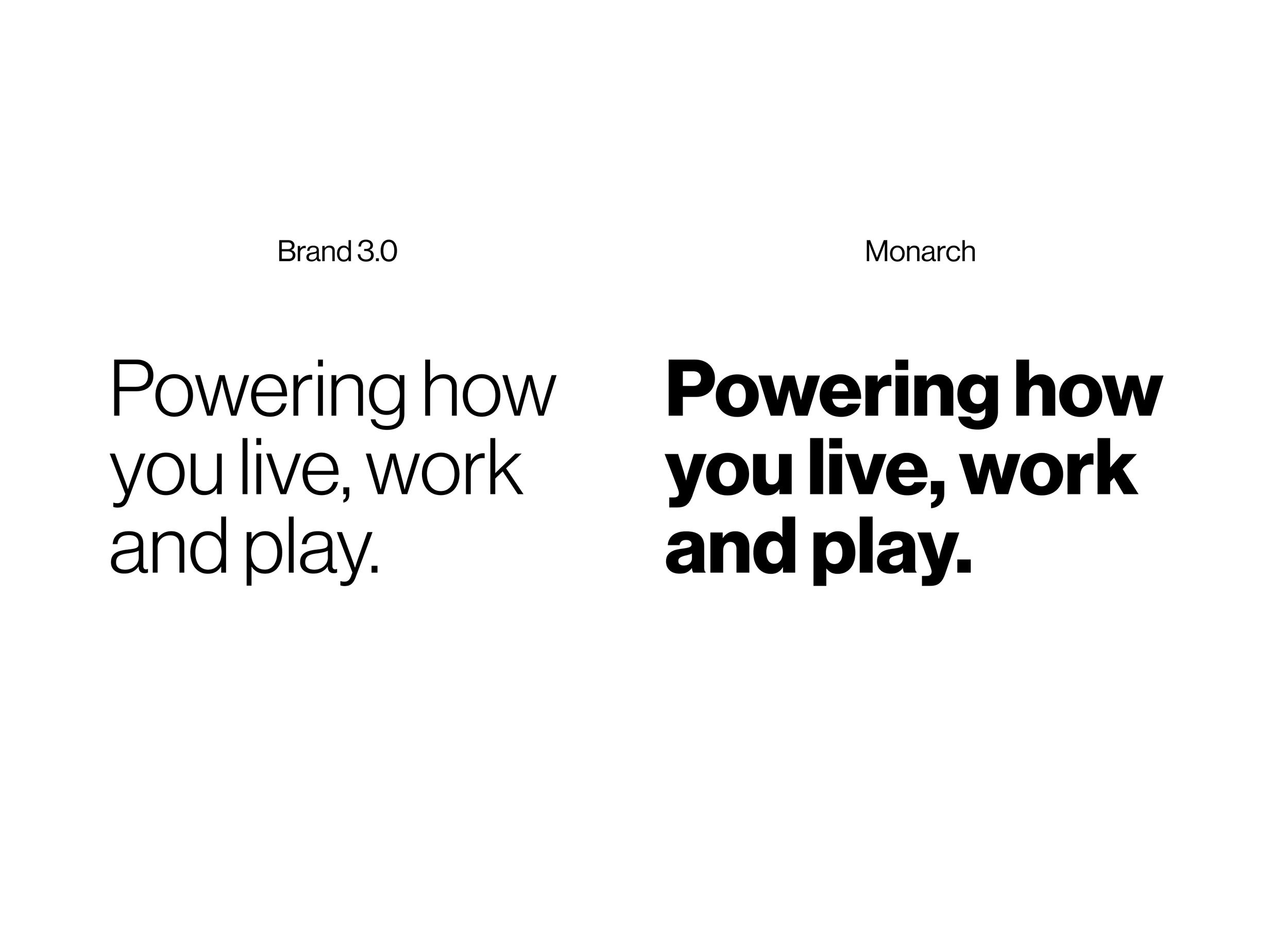
Bending without breaking
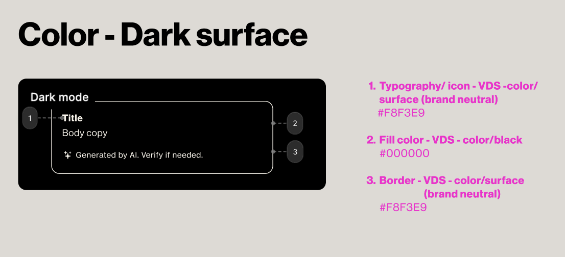
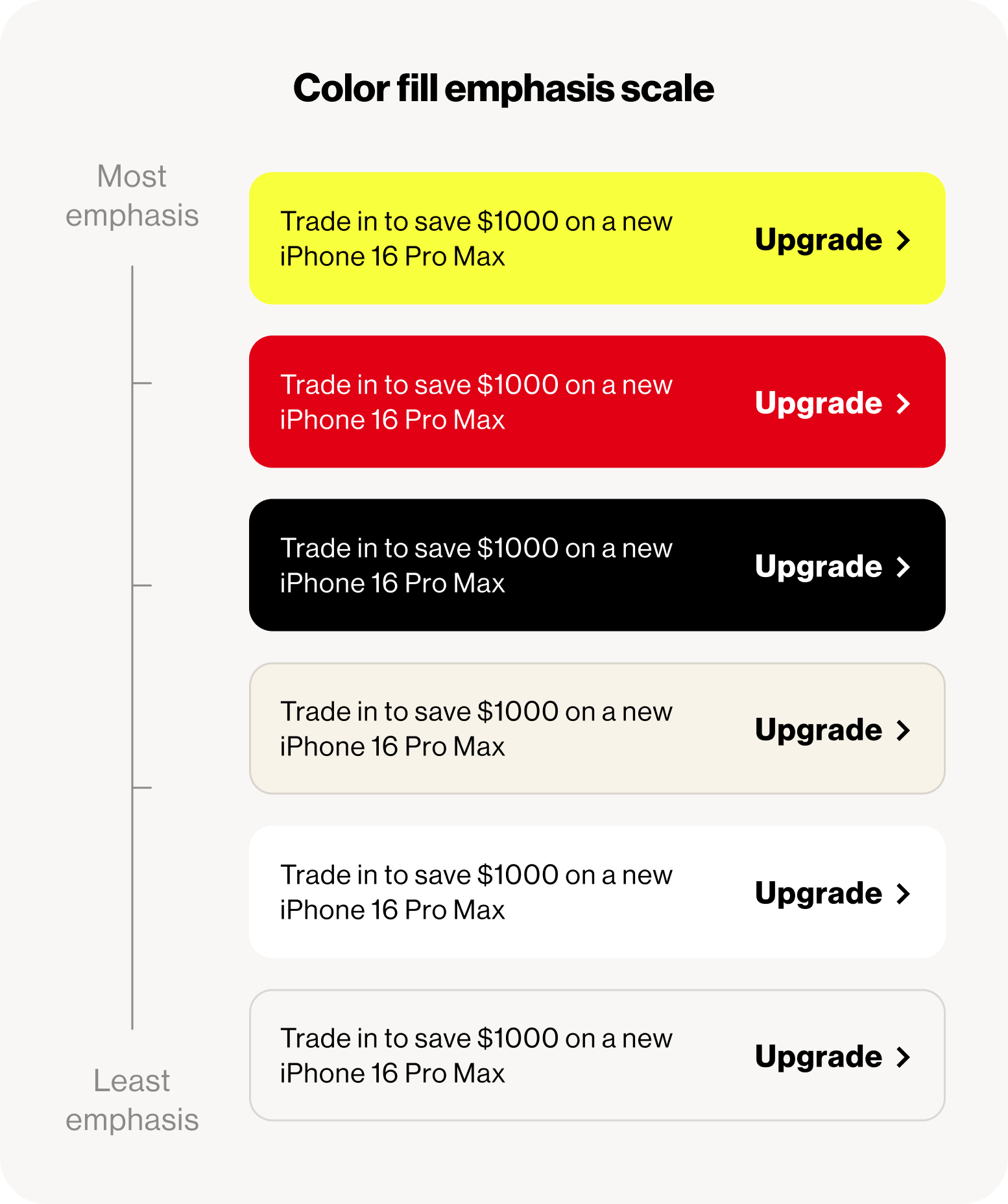
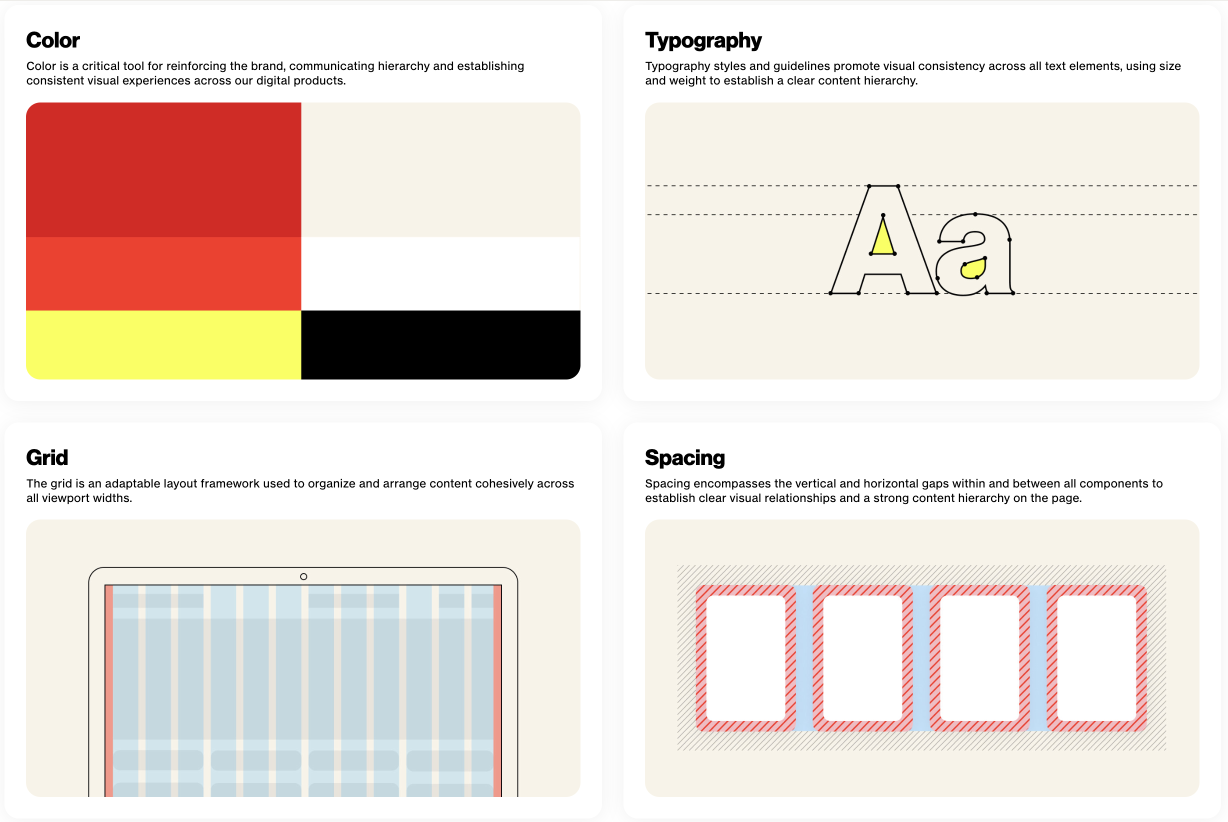
I helped define and document key visual rules that translated Monarch’s bold brand into scalable product guidance, including:
Moving the edges and corner radius to smoother, softer experience
Updated the color pallet and added a new red, yellow and stone color for brand highlights
Clean do/don’t examples for product teams
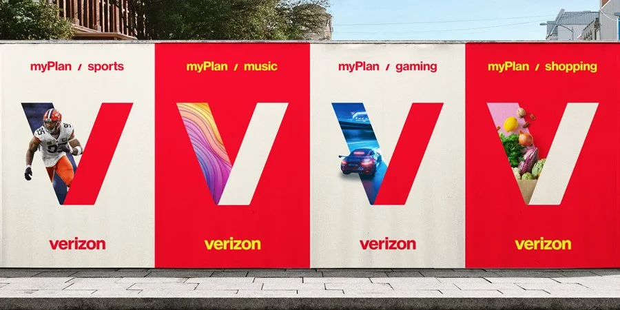
Updated color pallet
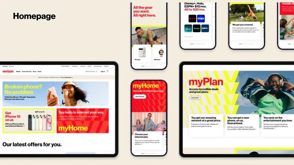
One of the key frameworks we introduced was progressive reduction of visual complexity as users move deeper into the funnel. I’ve documented the concept below:
Learn: High expression, bold color, rich imagery
Support: Reduced visual noise, task clarity
Transact: Minimal, focused, usability first
Inform: Readability and compliance driven
This framework became foundational for how teams applied the Monarch brand responsibly across product surfaces.
Further down the funnel
While a rebrand is often hard to isolate from broader company performance, Verizon’s overall brand momentum was strong through 2024 and into 2025.
The company was named Telecom’s Most Admired Company on the 2025 Fortune list, driven by innovation, expanded offerings, and customer focused strategy, of which the refreshed brand identity played a key role.
Impact
Artificial Intelligence
Defining scalable AI interaction patterns
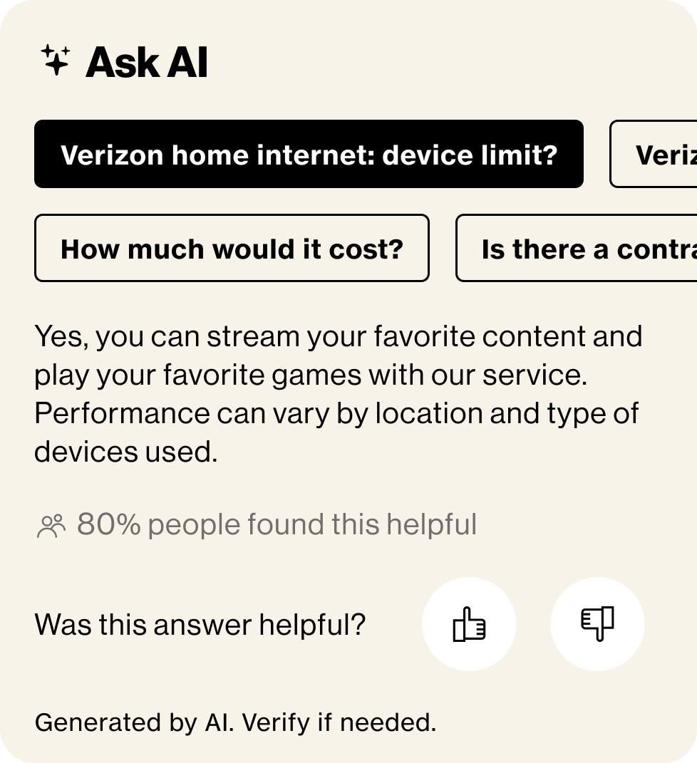
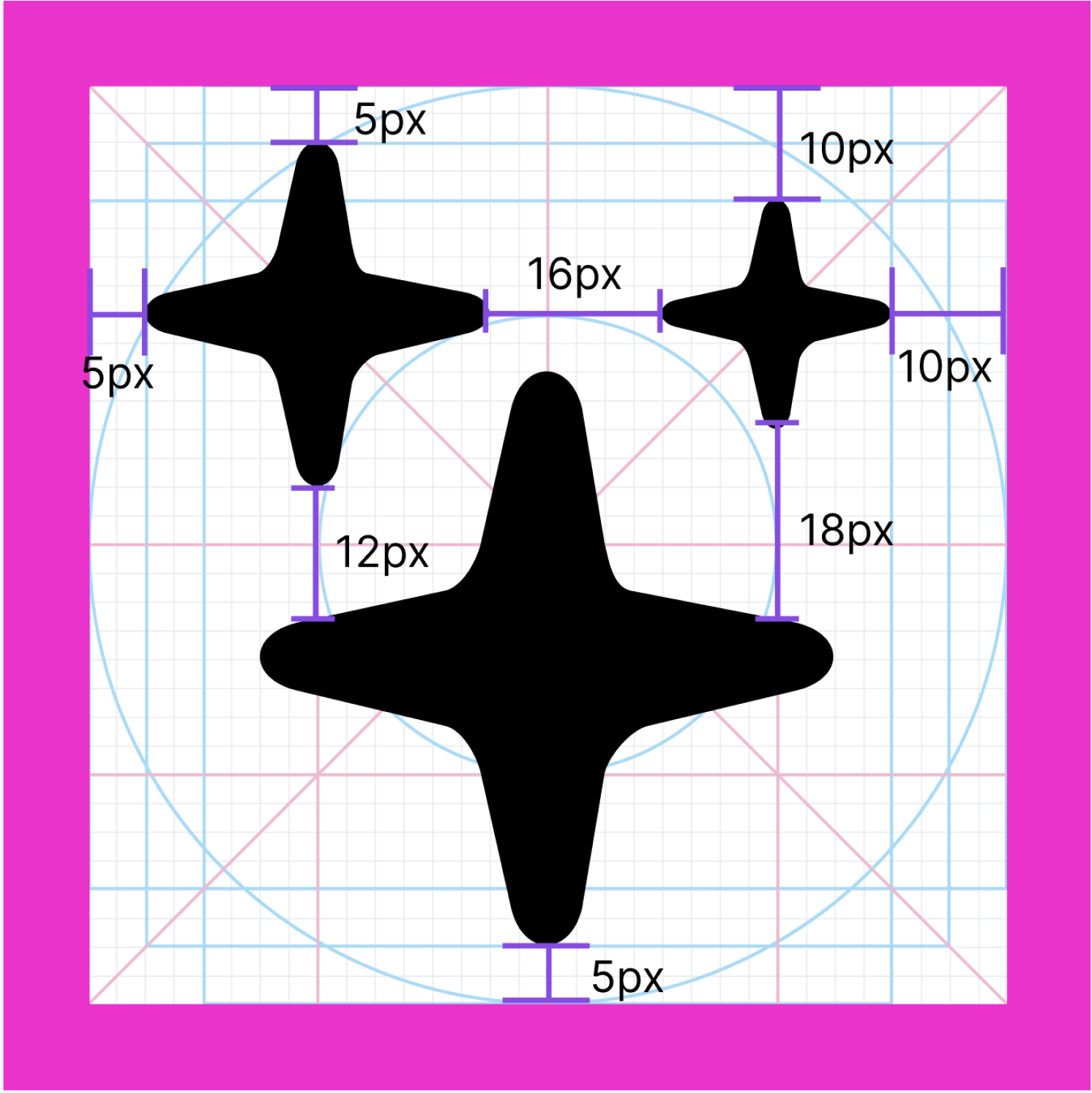
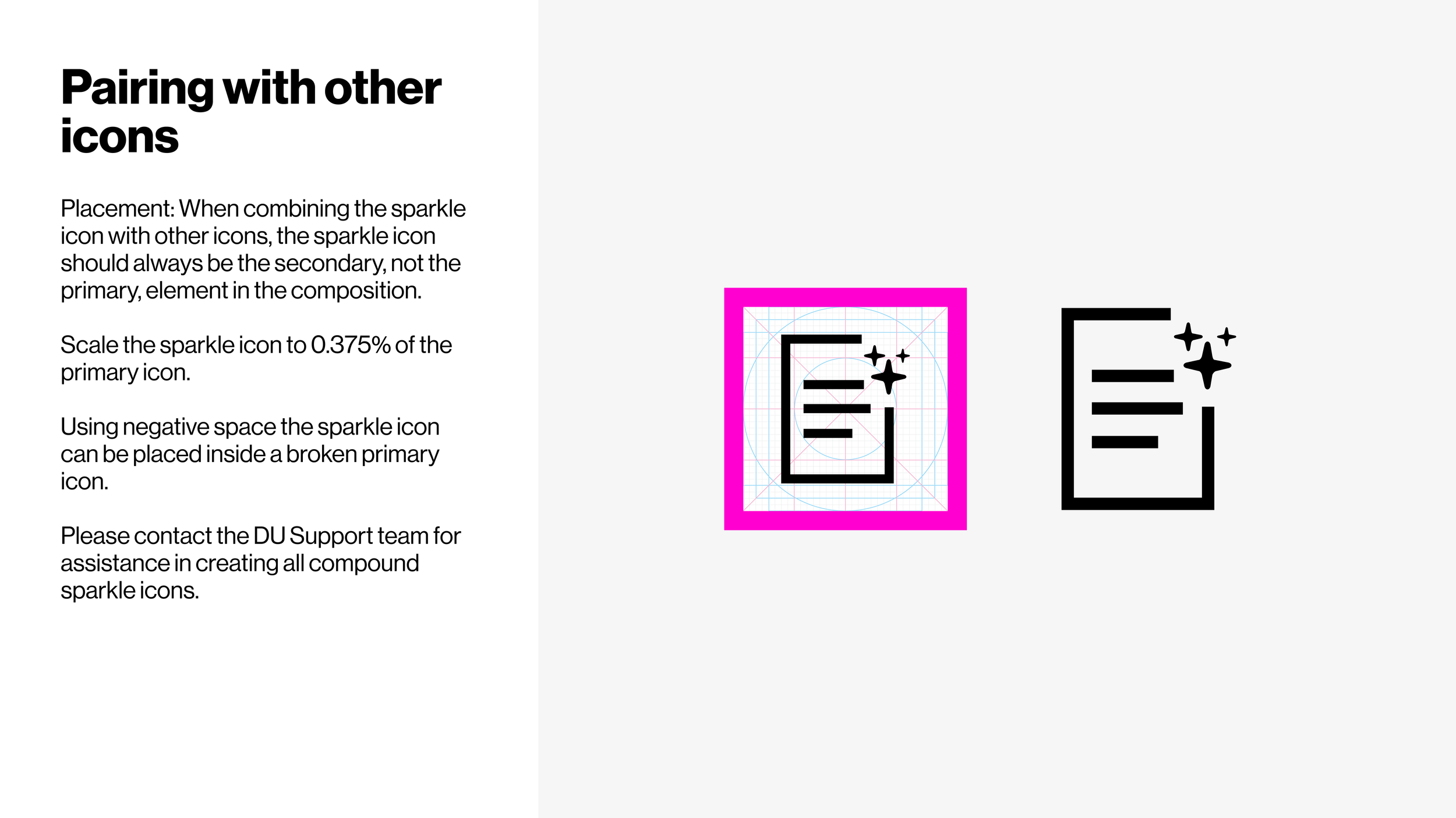
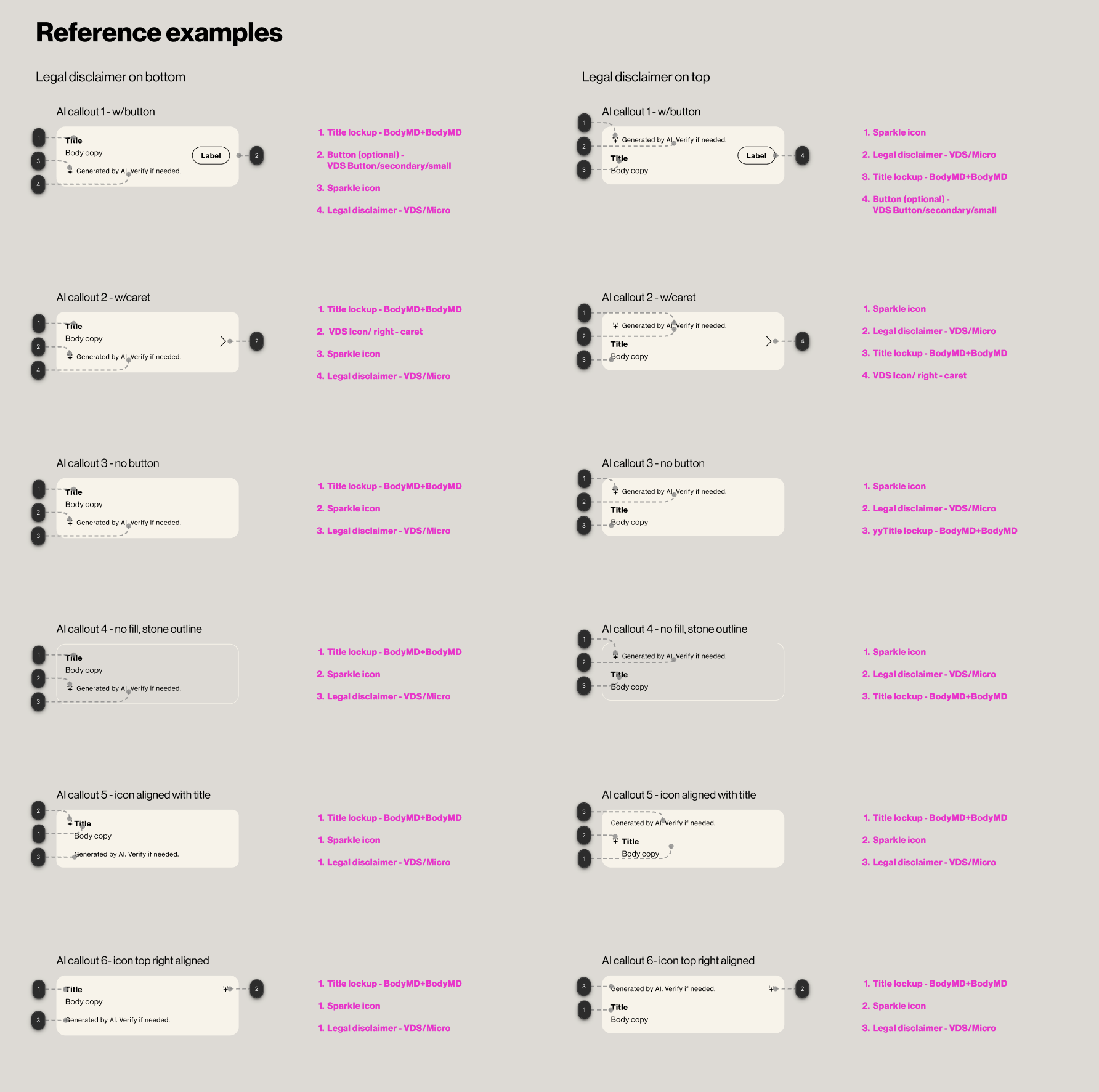
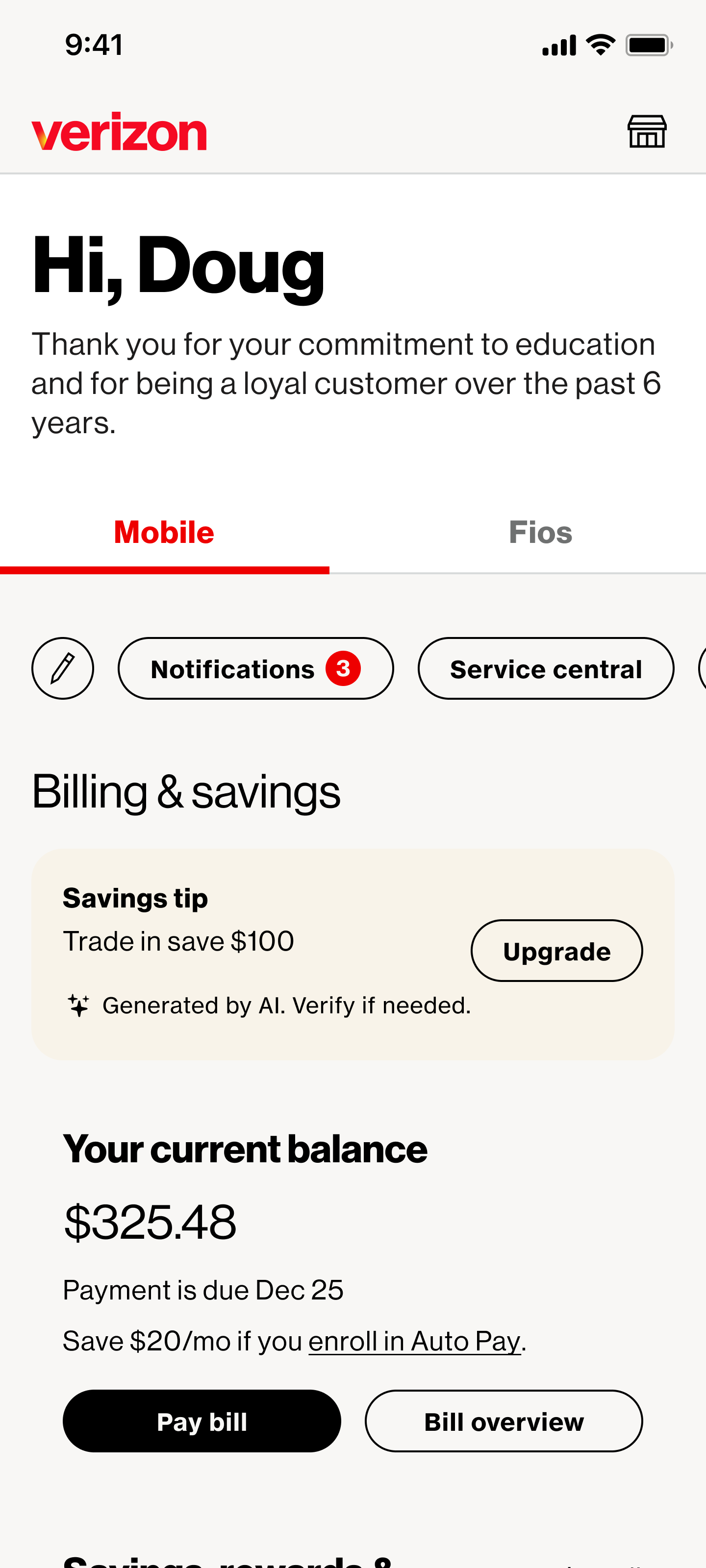
One of my most impactful contributions was creating Verizon’s AI Sparkle icon, a simple, flexible visual metaphor designed to scale across products.
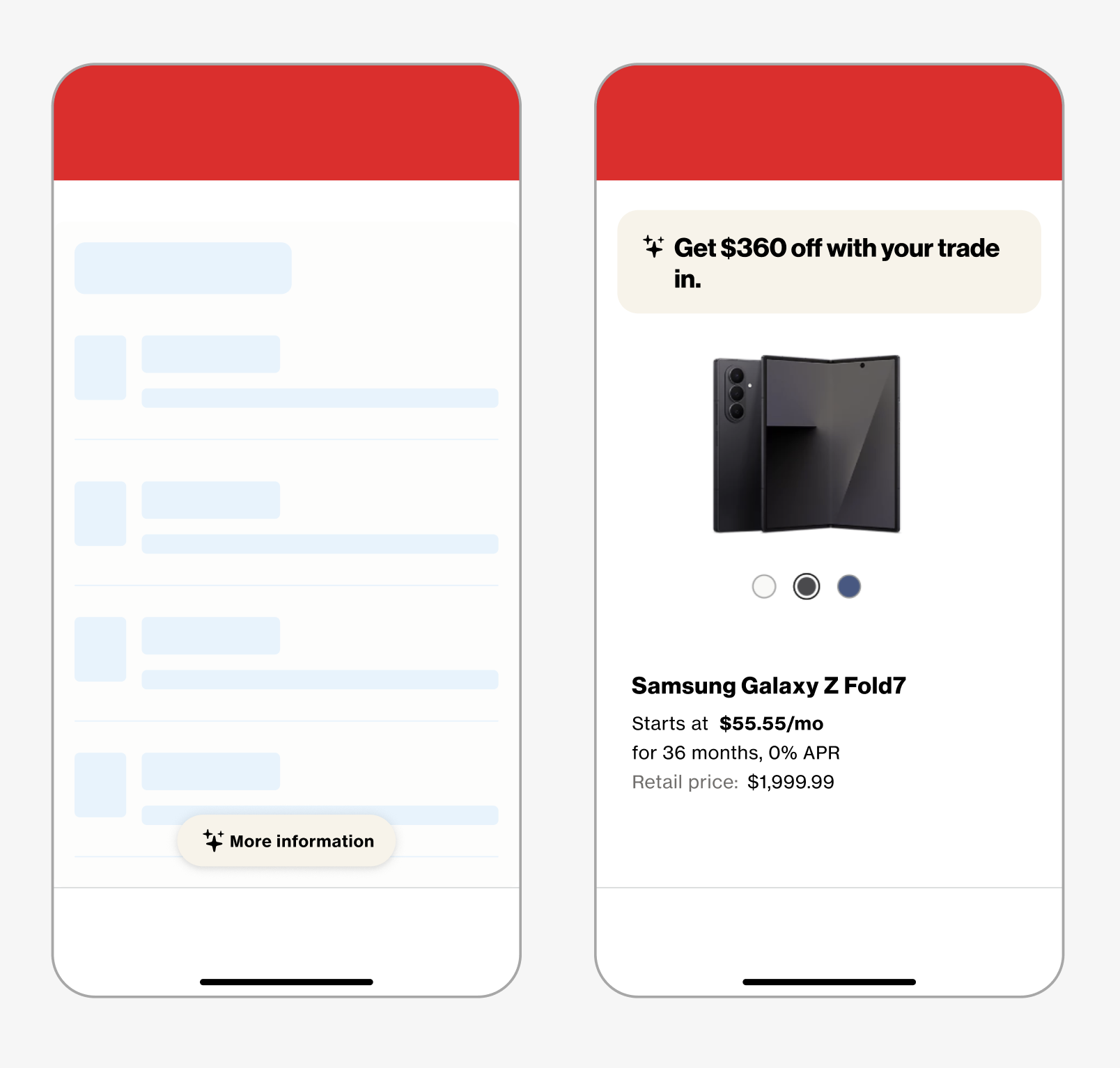
Beyond the icon, I designed a set of AI callout patterns that teams could use for:
* Feature discovery
* Inline assistance
* Proactive recommendations
In Practice
The goal of creating the AI patterns was universality:
* Neutral enough to work across use cases
* Distinct enough to signal “AI powered”
* Consistent across marketing and product
These patterns are now used across multiple Verizon experiences, helping introduce AI in a way that feels intentional and trustworthy.
AI callout examples

Impact

The AI design patterns translated emerging AI capabilities into usable, trustworthy, and shippable experiences. Enabling teams to confidently integrate AI across a wide range of real world use cases.
By defining clear interaction models, states, and behaviors, the patterns ensured AI features felt predictable, transparent, and human centered. This helped build user trust while reducing the cognitive load often associated with AI driven interfaces.
Digital Unity Team
Designing the Rules of the System
The DU team focused on creating simple, consistent, and user focused digital experiences across Verizon's apps and web, balancing business and user needs through system design.
Stewards of the brand
We were responsible for keeping the digital brand consistent, creating systems and standards, and ensuring quality of delivery.
We defined experiences for app, web, kiosk, tv, IVR, chat, and tablet.

Pattern Governance & Design Critique
Beyond creating guidelines, I regularly reviewed and critiqued work from journey teams, helping designers:
Apply new patterns/components correctly
Adjust visual density based on user intent
Balance brand expression with usability
This role required strong design judgment, communication, and trust. The idea was to ensure standards felt enabling, not restrictive.
Impact
By investing in scalable systems rather than one-off solutions, Digital Unity positioned Verizon to evolve rapidly as new platforms, products, and technologies emerged, without sacrificing consistency or quality.
As a member of the DU team, I helped create a more unified, efficient, and future-ready digital ecosystem that empowered teams to deliver high-quality customer experiences at scale.
Reflection
Working at Verizon reinforced the importance of systems thinking at scale. Designing isn’t just about a set of screens. It’s about creating shared understanding across hundreds of contributors to make a product that helps customers solve real world problems.
This role combined what I care most about:
Craft, rigor and clarity
Mentorship and critique
Designing frameworks that empower teams
Staying on the cusp of adapting technology like AI
It has been a defining chapter in my growth as a designer.